shape的绘制和使用
工程目录中有一个drawable文件夹,里面存放的是一些静态的图片资源文件。
比如位图文件(.png、.9.png、.jpg、.gif);或一些可绘制对象资源子类型的 XML 文件(本文称为drawable文件)。
当我们想给button或者TextView设定背景时,我们会想到纯色背景。如果要求圆角背景,或是渐变色背景,我们该如何实现呢?
一种办法是制作相应的美术素材,也就是切图。另一种办法是使用xml格式的资源文件。
本文要介绍的是shape。使用这类资源,可以完成一些比较简单的美术设计。
一个小栗子🌰
接下来我们新建一个shape试试,要求带有外围边框,有圆角,里面用渐变色填充。
在res/drawable/目录中,右键新建一个Drawable Resource file文件,起名shape_rect_gradient_red.xml。
root element选择shape。完整代码写成下面的样子:
<?xml version="1.0" encoding="utf-8"?>
<shape xmlns:android="http://schemas.android.com/apk/res/android"
    android:shape="rectangle">
    <stroke
        android:width="2dp"
        android:color="#0E30B1" />
    <corners android:radius="6dp" />
    <gradient
        android:centerColor="#F55353"
        android:endColor="#F71515"
        android:startColor="#FD7575" />
</shape>
android:shape="rectangle"表示的是选择长方形的形状。
stroke标签代表的是边框。里面设定边框宽度是2dp,边框颜色是#0E30B1。
corners标签代表的是圆角。如果不设置,则默认为直角。这里我们设定圆角的半径为6dp。
gradient表示渐变色。分别可以设置起始,中间和结束的颜色值。
在layout中,给Button的background设置使用这个shape。xml的文件名就是它的资源名称。
    <Button
        android:layout_width="match_parent"
        android:layout_height="wrap_content"
        android:background="@drawable/shape_rect_gradient_red" />
<Button
android:layout_width="match_parent"
android:layout_height="wrap_content"
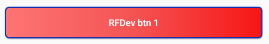
android:background="@drawable/shape_rect_gradient_red"
android:text="RFDev btn 1"
android:textAllCaps="false"
android:textColor="#ffffff" />
运行一下,可以看到效果。
shape介绍
shape又称为“形状可绘制对象”。为了简便,以下都称作shape或者“shape文件”。 shape是一种在 XML 文件中定义的通用形状。经过编译后,可以得到GradientDrawable对象。
资源引用
在 Java 中:R.drawable.filename
在 XML 中:@[package:]drawable/filename
语法
上面那个栗子我们认识了几个元素,gradient,corners和stroke。下面是语法的详细介绍。
<?xml version="1.0" encoding="utf-8"?>
<shape
    xmlns:android="http://schemas.android.com/apk/res/android"
    android:shape=["rectangle" | "oval" | "line" | "ring"] >
    <corners
        android:radius="integer"
        android:topLeftRadius="integer"
        android:topRightRadius="integer"
        android:bottomLeftRadius="integer"
        android:bottomRightRadius="integer" />
    <gradient
        android:angle="integer"
        android:centerX="float"
        android:centerY="float"
        android:centerColor="integer"
        android:endColor="color"
        android:gradientRadius="integer"
        android:startColor="color"
        android:type=["linear" | "radial" | "sweep"]
        android:useLevel=["true" | "false"] />
    <padding
        android:left="integer"
        android:top="integer"
        android:right="integer"
        android:bottom="integer" />
    <size
        android:width="integer"
        android:height="integer" />
    <solid
        android:color="color" />
    <stroke
        android:width="integer"
        android:color="color"
        android:dashWidth="integer"
        android:dashGap="integer" />
</shape>
详细元素介绍请参见 https://developer.android.google.cn/guide/topics/resources/drawable-resource.html#Shape
圆角背景的栗子🌰
上文介绍了corners的用法。我们来看一个圆角背景的实现方法。
新建文件shape_btn_2_normal.xml
<?xml version="1.0" encoding="utf-8"?>
<shape xmlns:android="http://schemas.android.com/apk/res/android"
    android:shape="rectangle">
    <solid android:color="#6CB3DD" />
    <corners android:radius="25dp" />
</shape>
在layout中给TextView使用这个背景。
    <TextView
        android:id="@+id/tv1"
        android:layout_width="match_parent"
        android:layout_height="50dp"
        android:background="@drawable/shape_btn_2_normal"
        android:gravity="center"
        android:text="RFDev 圆角背景TextView 1"
        android:textColor="#ffffff" />

如果想要渐变色,再增加gradient的设置就好。
代码中使用资源
在java代码中使用资源,比如在activity中设置背景。
Resources res = getResources();
Drawable shape = ResourcesCompat.getDrawable(res, R.drawable.shape_btn_2_normal, getTheme());

TextView tv = (TextView)findViewById(R.id.tv1);
tv.setBackground(shape);
使用这种方式,我们可以自己实现一些简单的按钮效果。更复杂的颜色和效果,需要美术设计师的支持。
工程放这里: https://gitee.com/rustfisher/AndroidTutorial
环形的栗子🌰
尺寸和长度自己设定。
环形 thumb_round_1.xml。
<?xml version="1.0" encoding="utf-8"?>
<shape xmlns:android="http://schemas.android.com/apk/res/android"
    android:shape="oval">
    <solid android:color="#ffffff" />
    <stroke
        android:width="@dimen/audio_seek_bar_thumb_ring_width"
        android:color="#7095fc" />
    <size
        android:width="@dimen/audio_seek_bar_thumb_size"
        android:height="@dimen/audio_seek_bar_thumb_size" />
</shape>
带渐变的环形 thumb_round_progress_1.xml。
<?xml version="1.0" encoding="utf-8"?>
<layer-list xmlns:android="http://schemas.android.com/apk/res/android">
    <item>
        <shape android:shape="oval">
            <size
                android:width="@dimen/audio_seek_bar_thumb_size"
                android:height="@dimen/audio_seek_bar_thumb_size" />
            <solid android:color="#ffffff" />
        </shape>
    </item>
    <item>
        <shape
            android:innerRadius="4dp"
            android:thicknessRatio="6"
            android:shape="ring"
            android:useLevel="false">
            <gradient
                android:endColor="#ffffff"
                android:startColor="#7095fc"
                android:type="sweep" />
            <size
                android:width="@dimen/audio_seek_bar_thumb_size"
                android:height="@dimen/audio_seek_bar_thumb_size" />
        </shape>
    </item>
</layer-list>
工程放这里: https://gitee.com/rustfisher/AndroidTutorial